Picking the Right Chart Library (Without the Headache)
Data is boring. Until you visualize it.
We’ve all been there: staring at a JSON response full of analytics data, knowing that your users (and your boss) aren't going to parse a raw array of 500 integers. They need to see the trend. They need a line going up and to the right.
The problem is, building charts from scratch is painful. Dealing with SVG paths, scaling axes, and calculating pixel coordinates is a rabbit hole you usually don't have time for.
This is where Chart.js shines.
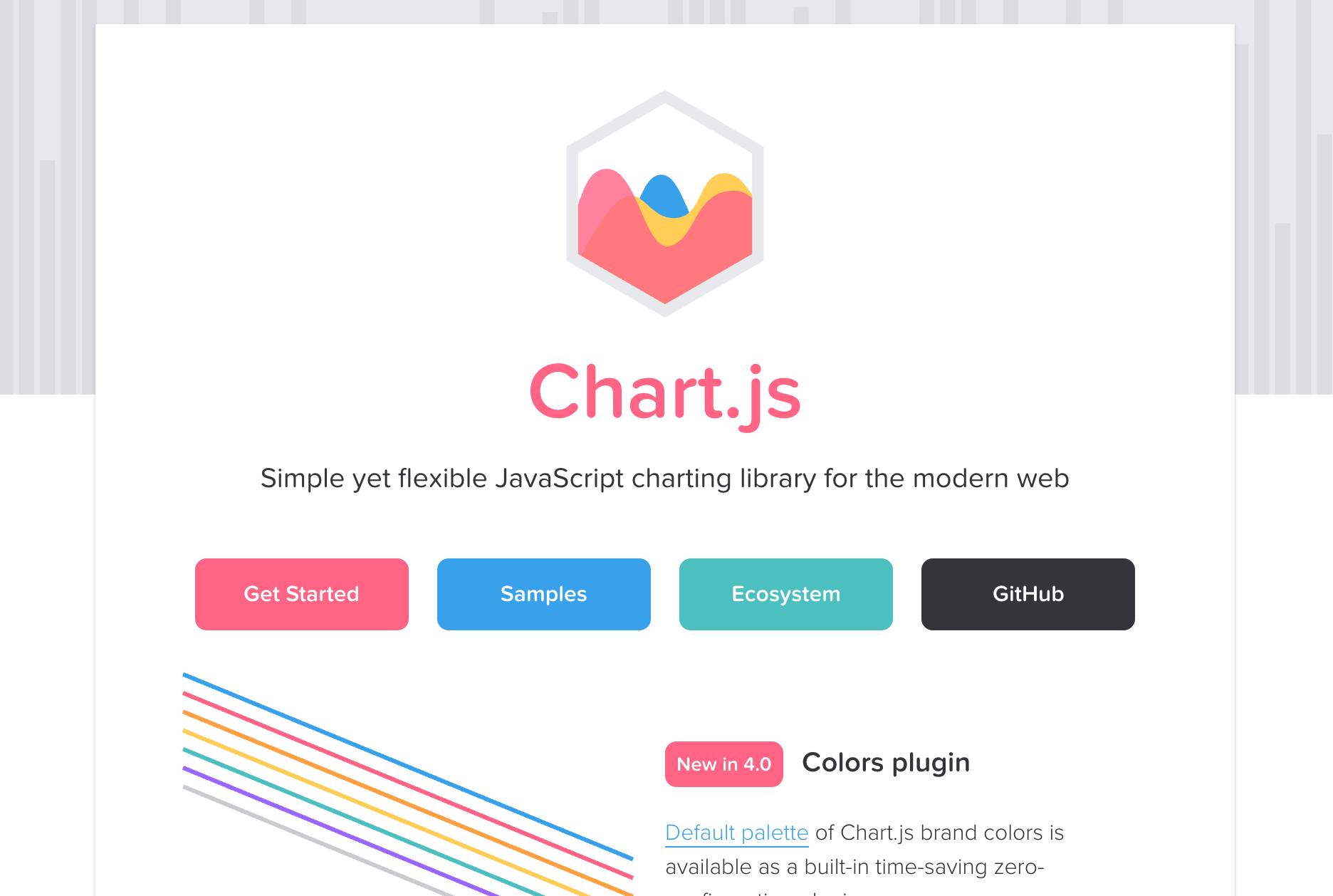
It is my go-to library when I need to get a dashboard up and running by EOD. It’s lightweight, it renders on HTML5 Canvas (meaning it’s fast), and it makes your data look professional with almost zero CSS tweaking.
The "It Just Works" Tutorial
Let’s say your Product Manager just slacked you. They want a "Monthly Active Users" chart on the admin panel. They want it now.
Here is how you do it in under 5 minutes.
1. The Setup
You don't need a complex build step. If you are just testing the waters, you can drop this right into your HTML.
HTML
<script src="https://cdn.jsdelivr.net/npm/chart.js"></script>
(If you are using React/Vue, just npm install chart.js and import Chart from 'chart.js/auto')
2. The Canvas
Chart.js needs a home. It lives inside a <canvas> tag.
HTML
<div style="width: 800px;">
  <canvas id="myChart"></canvas>
</div>
3. The Magic
Here is the actual JavaScript. Notice how readable this is? It creates a configuration object rather than requiring you to write complex logic.
JavaScript
const ctx = document.getElementById('myChart');

new Chart(ctx, {
  type: 'bar', // The type of chart: bar, line, pie, etc.
  data: {
    labels: ['Jan', 'Feb', 'Mar', 'Apr', 'May', 'Jun'],
    datasets: [{
      label: 'Monthly Active Users',
      data: [1200, 1900, 3000, 5000, 2000, 3000],
      borderWidth: 1,
      backgroundColor: '#36A2EB', // Nice blue color
    }]
  },
  options: {
    scales: {
      y: {
        beginAtZero: true
      }
    }
  }
});
That’s it. You save the file, refresh the page, and the bars animate up from zero. It looks polished immediately.
What About the Alternatives? (ApexCharts, Recharts, etc.)
While I love Chart.js for its "get it done" attitude, the JavaScript ecosystem is massive, and sometimes you need a different tool for the job.
Here are the other heavy hitters I keep in my back pocket:
1. ApexCharts (The "Modern" Choice)
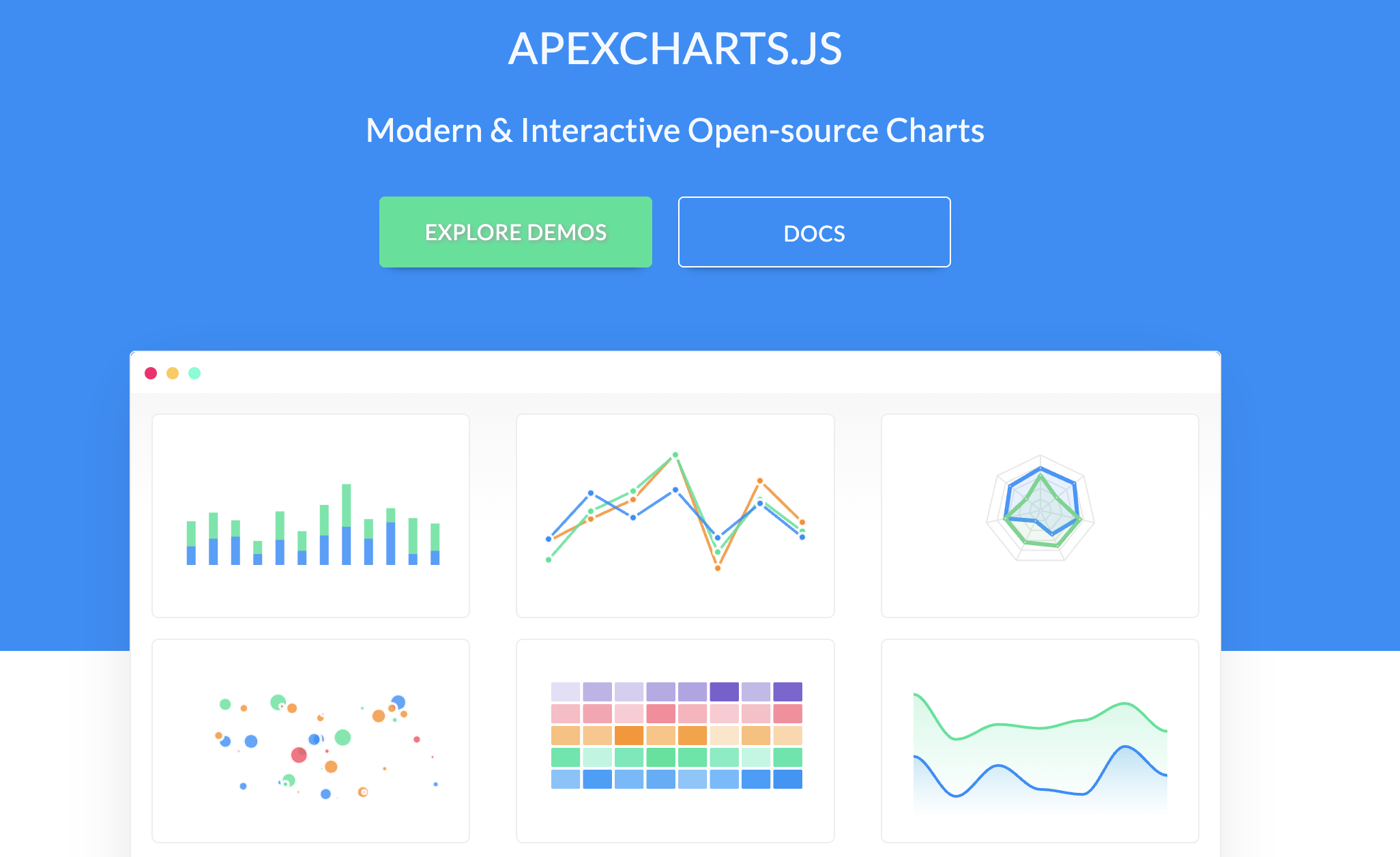
If Chart.js feels like a reliable sedan, ApexCharts is the flashy sports car.
- Why use it? It uses SVG instead of Canvas, meaning the interactivity (hovering, clicking, zooming) often feels sharper and more responsive. It also comes with incredible default themes that look "2025" right out of the box.
- The Catch: Because it uses SVG (creating DOM elements for every bar/point), it can get laggy if you try to render 10,000+ data points at once. Chart.js (Canvas) handles massive datasets better.
2. Recharts (The React Specialist)
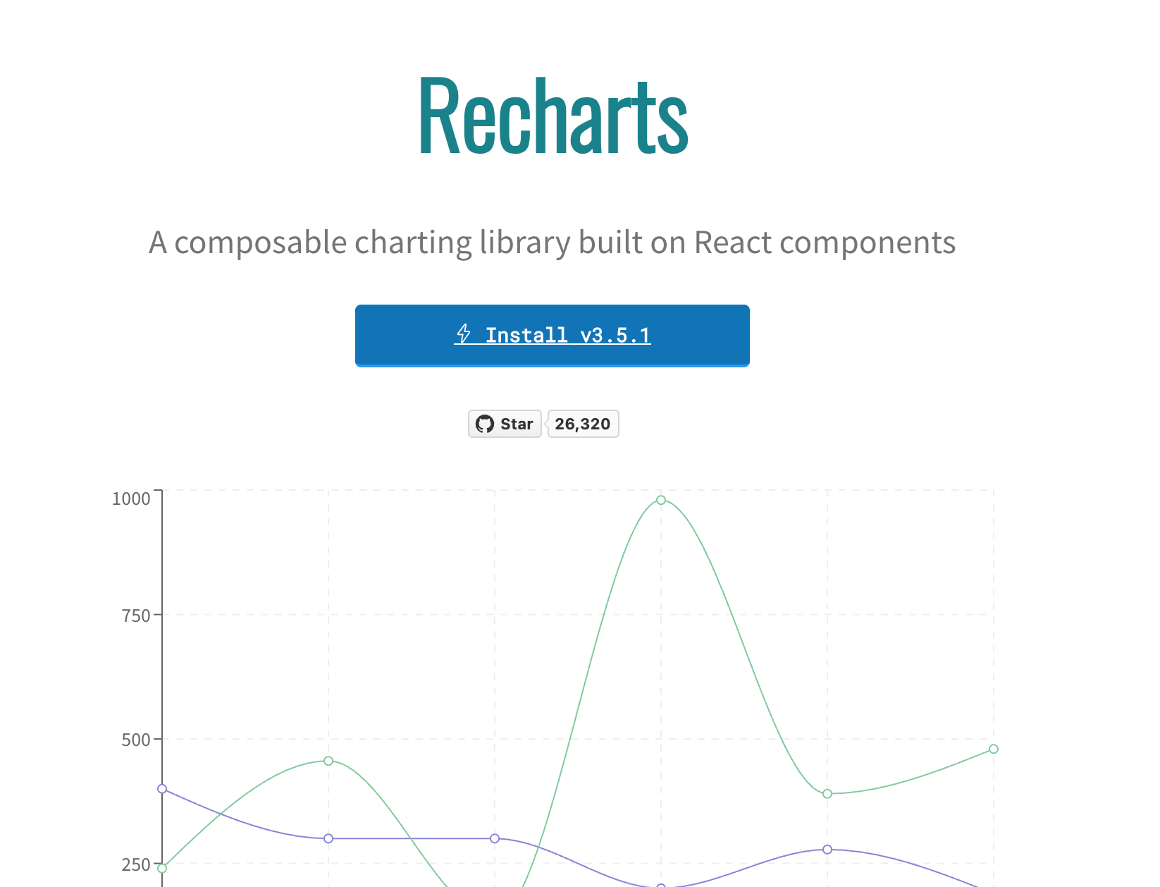
If you are strictly in React land, Recharts is beautiful.
- Why use it? It’s "Composability" heaven. You build charts like you build HTML:
<BarChart><XAxis /><YAxis /><Bar /></BarChart>. It feels very native to the React workflow. - The Catch: It is strictly for React. If you move to Vue or Svelte later, you have to relearn everything.
3. Highcharts (The Enterprise Beast)
- Why use it? If you are building a banking app or a stock trading platform, you use Highcharts. It is the most robust, battle-tested library on the planet.
- The Catch: It is not free for commercial use. You have to pay (a decent amount) to use it in a for-profit product.
Final Thoughts
We often over-engineer our frontend stacks. We grab the most complex tool because it feels "serious." But there is a quiet joy in using a library that respects your time.
If you want a modern, interactive feel and have small datasets? ApexCharts is great. If you are locked into React? Recharts is your friend. But if you just need a solid, performant chart that works everywhere? Stick with Chart.js.